
Disclaimer: As an Amazon Associate, I earn from qualifying purchases. Links in this article may be affiliate links.
Introduction
When I think about creating a colorful boho living room, I’m instantly transported to spaces filled with vibrant textiles, eclectic art pieces, and an undeniable sense of freedom. The bohemian style celebrates individuality, creativity, and a carefree approach to design that resonates with so many of us seeking to express ourselves through our homes.
Color is the heartbeat of boho design. Unlike minimalist or traditional styles, bohemian interiors embrace color in all its glory—from rich jewel tones to earthy neutrals with unexpected pops of brightness. I’ve found that selecting the right color palette is crucial to achieving that perfect boho balance between vibrant expression and a harmonious, livable space.
In my years of designing and experimenting with bohemian spaces, I’ve discovered that certain color combinations work particularly well. Today, I’m sharing my five favorite color palettes that will help you create a colorful boho living room that feels both authentic and intentional.

- Adjustable louvered roof lets you control sun, shade, and airflow.
- Built-in gutter system keeps the area dry during rain.
- Durable powder-coated aluminum frame resists rust and weather.
- Includes waterproof curtains and mosquito netting for privacy and protection.

- Smooth contours and seamless design
- Up to 325 square feet of shaded paradise
- Features 4.53×4.53 inch reinforced columns
- Say goodbye to water buildup woes! Our innovative drainage system of this hardtop pergola discreetly whisks away excess water
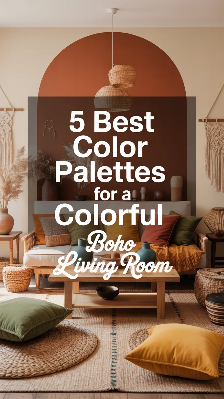
1. Earthy Tones with Pops of Color
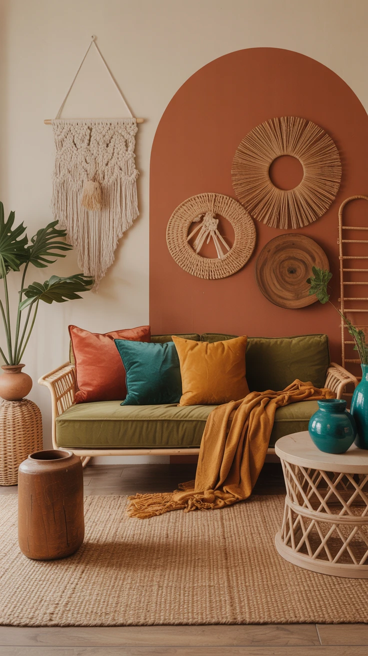
My first boho apartment taught me that earthy tones create the perfect foundation for a bohemian space. This palette grounds your room while still allowing for playful expression through strategic color placement.
- Base colors: Terracotta, olive green, mustard yellow, and warm browns
- Accent colors: Teal, coral, or bright turquoise
- Complementary neutrals: Cream and tan
What I love about this palette is how it mimics the natural world. The warm terracotta reminds me of desert landscapes, while olive greens bring in elements of lush vegetation. These colors work beautifully with natural materials like rattan, jute, and unfinished woods—all staples in bohemian design.
For my living room, I painted one accent wall in a rich terracotta and kept the remaining walls a warm cream. I then layered in olive green cushions, a mustard throw blanket, and added unexpected pops of teal through ceramic vases and artwork.
To test this palette without committing to paint, start with a mustard throw blanket, a couple of terracotta planters, and an olive green pillow or two—small changes that still make a big impact.
Pro Tip: When working with earthy tones, incorporate plenty of natural textures to enhance the organic feel. Think macramé wall hangings, woven baskets, and wooden accent pieces. These textures add depth to your color palette and reinforce the bohemian connection to nature.
2. Jewel Tones for a Luxurious Look
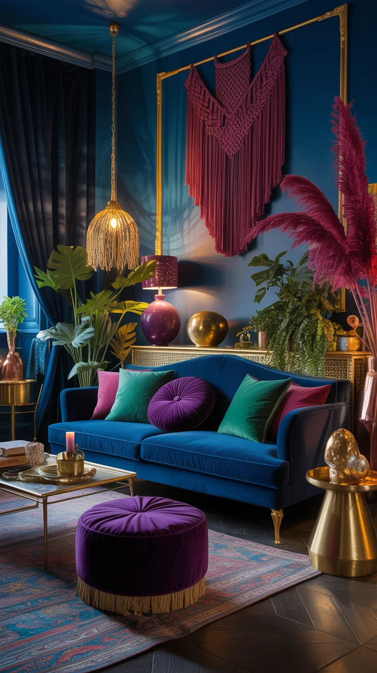
If you’re drawn to rich, saturated colors, a jewel-toned palette might be your perfect match for a colorful boho living room. This approach creates a space that feels both opulent and inviting.
- Primary colors: Emerald green, sapphire blue, amethyst purple
- Secondary colors: Ruby red, topaz yellow
- Metallic accents: Gold, brass, or copper
I once helped a friend transform her living room using this palette, and the results were stunning. We started with a deep blue velvet sofa as our anchor piece, then added emerald green cushions and a purple ottoman. The key was balancing these bold colors with enough neutral space to let each jewel tone shine.
What surprised me was how cozy the space felt despite the richness of the colors. There’s something about jewel tones that creates an intimate atmosphere, perfect for evening gatherings or quiet nights in.
If you’re not ready to commit to a velvet sofa, try layering in a jewel-toned emerald green velvet pillow or sapphire blue curtains to test the look.
Pro Tip: Velvet and silk fabrics enhance the luxurious feel of jewel tones. I recommend incorporating at least one velvet piece—whether it’s a sofa, armchair, or even just cushions—to add depth and richness to your color palette. Metallic accents in gold or brass further elevate the look, creating a bohemian space with a touch of glamour.
3. Pastel Hues for a Soft Boho Vibe
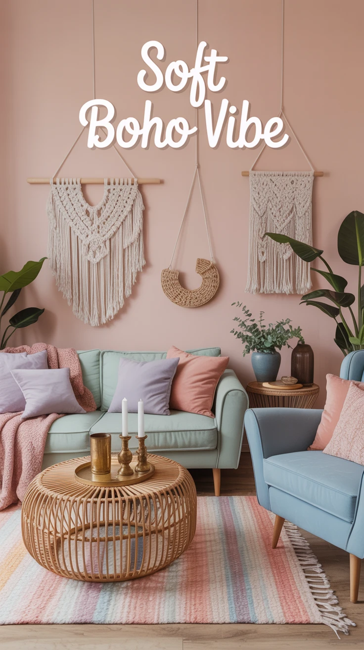
Not all bohemian spaces need to feature bold, intense colors. A softer approach using pastels can create an equally beautiful boho living room with a more serene atmosphere.
- Base colors: Blush pink, mint green, powder blue
- Accent colors: Lavender, soft coral
- Neutrals: White, cream, light beige
I discovered the power of pastels in boho design when renovating a small apartment with limited natural light. The soft colors helped brighten the space while still maintaining that eclectic boho character I was after.
What works particularly well with this palette is the layering of different pastel shades. Rather than sticking to just one or two colors, I incorporated a range of soft hues through textiles, artwork, and accessories. The result was a space that felt cohesive yet interesting, with enough variation to honor the bohemian spirit.
Pro Tip: Balance pastel colors with natural elements to prevent the space from feeling too sweet or juvenile. I like to add rattan furniture, macramé in natural fibers, and plants to ground the soft colors. Additionally, incorporating a few small metallic accents—like brass candle holders or a copper side table—adds sophistication to a pastel boho palette.
4. Bold and Bright with a Mix of Patterns
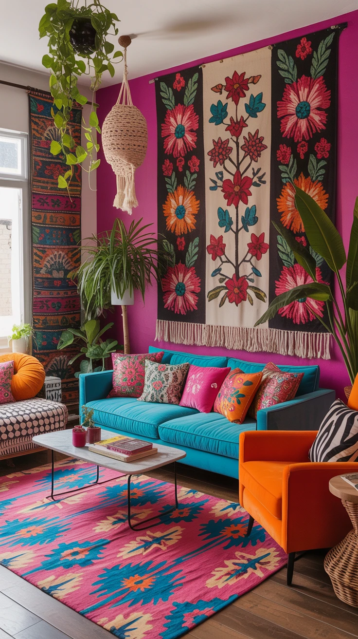
For the color-confident, this palette embraces the most vibrant aspect of bohemian style. It’s about celebrating color in its most joyful form, paired with an eclectic mix of patterns.
- Primary colors: Magenta, turquoise, bright orange, electric blue
- Pattern mixing: Ikats, florals, geometrics, global prints
- Balancing elements: Black and white accents
I’ll admit, this is the palette I was most intimidated by when I first started exploring boho design. My early attempts resulted in spaces that felt chaotic rather than curated. The breakthrough came when I learned to balance the bright colors with enough neutral space and to be intentional about pattern mixing.
Now, this bold approach is actually one of my favorites. There’s something incredibly freeing about embracing color with such enthusiasm, and the resulting space never fails to lift my mood.
Pro Tip: When working with multiple bright colors, choose either your walls or your furniture as your color focus—not both. I’ve found that keeping walls relatively neutral (white or cream) allows colorful furniture and accessories to shine without overwhelming the space. Alternatively, if you prefer colorful walls, balance them with more subdued furniture in natural materials.
5. Neutral Base with Colorful Accents
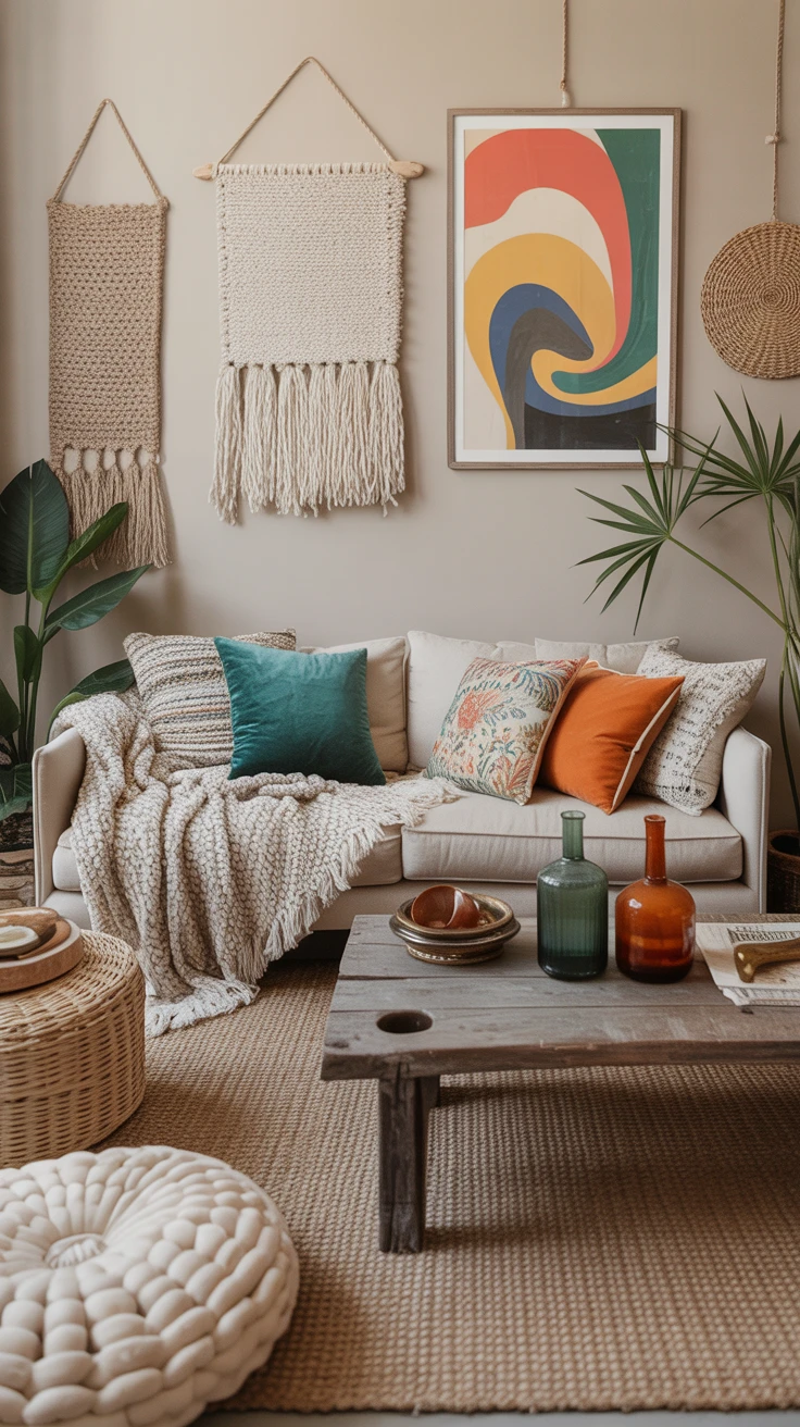
For those who appreciate the bohemian aesthetic but prefer a more subtle approach to color, this palette offers the perfect compromise.
- Base colors: Cream, beige, taupe, gray
- Accent colors: Any combination of boho brights (used sparingly)
- Textures: Multiple layers of neutral textiles with varied textures
I turned to this palette when designing a living room for a client who loved the boho look but was hesitant about committing to too much color. We created a neutral foundation with cream walls, a beige sofa, and natural fiber rugs, then added carefully chosen colorful elements—teal and orange cushions, a vibrant piece of wall art, and a collection of colored glass vases.
What I appreciate about this approach is its versatility. The neutral base allows you to easily update your space by swapping out colorful accents, whether seasonally or as your preferences evolve.
Start small with a neutral rug and sofa, then bring in color through interchangeable pieces like boho throw blankets, cushion covers, and art prints. It’s a low-commitment way to play with color without repainting or buying new furniture every time your style shifts.
Pro Tip: With a neutral palette, texture becomes even more important. I recommend incorporating multiple textural elements—chunky knit throws, tasseled cushions, woven wall hangings, and natural fiber rugs. These layers of texture add visual interest even with a limited color palette, ensuring your space still has that distinctive bohemian character.
Pro Tips for Creating a Colorful Boho Living Room
Beyond specific color palettes, I’ve gathered some general insights that have helped me create successful bohemian spaces:
- Mix old and new: Combine vintage finds with contemporary pieces for that authentic boho eclectic feel.
- Layer, layer, layer: Bohemian spaces thrive on layered textiles—rugs over rugs, multiple cushions, throws draped over furniture.
- Incorporate handmade elements: Whether it’s pottery, macramé, or textiles, handcrafted items add soul to a boho space.
- Don’t forget the plants: Greenery is essential in a colorful boho living room, adding life and an additional layer of texture.
- Follow your intuition: The most successful bohemian spaces reflect the personality of their inhabitants. Trust your instincts rather than following rigid design rules.
Conclusion
Creating a colorful boho living room is less about following strict guidelines and more about expressing your unique style through color, texture, and personal treasures. Whether you’re drawn to earthy tones, jewel-like richness, soft pastels, bold brights, or a neutral base with colorful accents, the bohemian approach welcomes your creativity.
I’ve found that the most successful boho spaces evolve organically over time, accumulating pieces that tell a story and reflect the lives of those who inhabit them. So while these color palettes provide a starting point, don’t be afraid to adapt and personalize them to create a space that truly feels like home.
Frequently Asked Questions
What are the must-have elements for a boho living room?
While there’s no strict formula, I’ve found that successful boho living rooms typically include: layered textiles (rugs, cushions, throws), plants, a mix of patterns, global-inspired elements, natural materials, and personal collections or artwork. The key is creating a space that feels collected rather than decorated.
How do I balance colors in my boho living room without it looking chaotic?
This was my biggest challenge when I started designing boho spaces! I recommend choosing a dominant color family, then adding complementary accents. Creating zones of color rather than spreading every hue throughout the space also helps. Additionally, incorporating neutral elements gives the eye places to rest between colorful moments.
Can I create a boho living room on a budget?
Absolutely! Some of my favorite boho spaces were created on tight budgets. Thrift stores, flea markets, and online marketplaces are excellent sources for unique, affordable pieces. DIY projects like macramé wall hangings or painted furniture can add personalized touches without breaking the bank. Focus on gradually collecting pieces you love rather than furnishing the space all at once.
How do I incorporate boho colors if I’m renting and can’t paint my walls?
As a longtime renter myself, I’ve faced this challenge often! Focus on bringing color through textiles (rugs, curtains, cushions, throws), artwork, furniture, and accessories. Large tapestries or fabric wall hangings can cover significant wall space without paint. Removable wallpaper is another option for temporary color that won’t damage walls.
How can I make my boho living room feel cohesive despite using multiple colors?
Cohesion in a colorful boho space comes from repetition and intention. I recommend repeating your key colors throughout the room rather than introducing each color just once. Also, consider the undertones of your chosen colors—selecting colors with similar undertones (all warm or all cool) helps create harmony even with diverse hues.